 |
| So this is it. The never-ending project has indeed come to an end. It's been such a long stretch, and yet it's flown by. Overall, I'd say that I'm happy with some elements of the work that I've achieved, but I feel honestly (as it's an on-going project) that nothing is resolved. It's a strange feeling, but an exciting one all the same. All of the work that I have done so far has given me the foundations to produce my final collection. My technical skills, particularly in regards to Adobe Illustrator have come on leaps and bounds, and I feel now that I can simply get on with things. No more experimentation. No more wasting time hammering out small details. My entire focus now is going to be on creating the final work. I'm honestly very excited to get on with creating it. |

Showing posts with label Practice. Show all posts
Showing posts with label Practice. Show all posts
P H A S E - S U M M A R Y | # 5
6.28 | F U L L - C I R C L E
 |
| This has been a long project. A really long project. I have found out rather a valuable lesson however; when working over such a long timescale, do occasionally take stock of where you are and collate all of your work. I'm finding now that I'm at the end of the project I'm bringing my work back to where I first started. Although I've developed the visuals for the project over the last unit, the concept has come full circle and ended back where it started. Now that I have brought all of the elements together I'm able to see exactly what I want to produce for the final unit of my time at university. I'm a little frustrated that it's taken me so long to see it, but on the other hand, I'm excited as I feel a renewed passion for the work that I'm going to produce for my portfolio. |
6.27 | T I M E - L A P S E
 |
| I have been experimenting with time lapse photography (again). I was looking to express a movement of light on screen. The process worked, but I have come to realise that I really need to prepare the shots that I want to use before I start, as even if the process works, it won't necessarily work well on screen. It is made more difficult as I am looking to get the shots at sunset, to continue the oppressive mood of the film. I'll keep trying. |
6.26 | U V - F A C E S
 |
| Continuing my testing for the production of the film, I have been looking at UV again, testing the effects on film and camera. Just from this, I have realised a lot about how I'm going to achieve the outcome that I want, without it looking messy. I really need to work on refining the visuals here to make a decent attempt at this. |
P H A S E - S U M M A R Y | # 4
 |
| Entering the final section of this project, I have come to the conclusion that what I'm trying to achieve now is simply testing out my ideas ready for the final degree show work. I have spent a long time testing fabrics and materials and figuring out the aesthetic of the work. When the final project begins, I will be able to head straight into creating the work for the degree show without worrying too much about figuring things out too much. I've created a good bit of work to build up my portfolio, which is what I really wanted from this time. |
6.25 | F O I L
 |
| After having some embossing plates made up, I have been experimenting with foiling and considering the covers of the finished book. Some of the samples were successful, some however weren't quite so. I have re-jiggered the designs a little to have made up into new plates. I can see now what I want to achieve with this. |
6.24 | F O N T
 |
| Above is an example of one of the fonts that I have created to feature in the book. It was trickier than I had anticipated, but I needed the font to encompass the aesthetic that I have been working towards- and nothing available was quite right. I have spent so much time working on the details, that it would be a shame for something like the font type to stick out. Each font is available in several different colours and luminosities. |
6.23 | B R A N D I N G // E M B O S S I N G
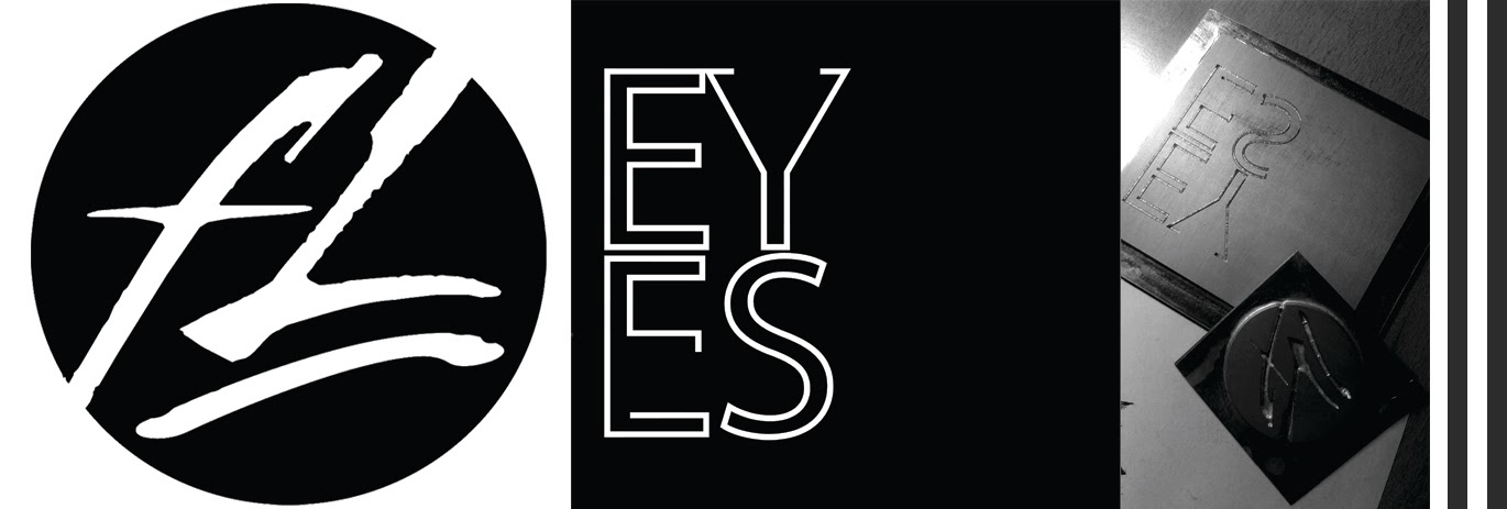 |
| I have been looking at branding for my website, and the book to be produced as part of this project. Through a fair bit of trial and error, I created various designs to compliment the project. I have had these designs made into custom printing blocks so that they can be embossed into the final product. I now need to test various foils and inks and how they work on top of my prints and the thermochromic inks. Hopefully having the designs embossed should add a different dynamic and more of a tactile quality to the finished piece. Hopefully anyway. |
6.22 | T H E R M O C H R O M I C
 |
| I want to create a book of illustrations that has hidden messages and meanings within it. I have been experimenting with ThermoChromic inks that change from black to translucent under heat. In the book, and on the cover, there will be images that can only be revealed when the book is being handled for a length of time. |
INTERNSHIP : LISA STANNARD
 |
| Recently, I have been gaining some work experience with MMU Textiles graduate, LISA STANNARD. Having gained a lot of success following her time at university, it has been lovely to get an insight into what it could be like, out there in the real world. Without sounding sycophantic, she has been a real inspiration for the future. |
artist|study : JEONGMOON CHOI
 |
| JEONGMOON CHOI is a Korean born artist, who specialises in the use of light and thread to create works that effect perceptions of space and room. Her work uses UV lighting, something that I have been experimenting with myself. If anything, seeing her work has encouraged me to think bigger and experiment more with the possibilities of what I can achieve. Her work has a real intricate beauty and delicacy to it. Simply wonderful. |
P H A S E - S U M M A R Y | # 3
 |
| This recent stage of the project has seen a lot of changes, both in terms of the direction of the project itself, but also in regards to my direction as an artist. I have explored a lot of new tools which have really opened up new opportunities creatively for me- the most significant of which being my use of digital illustration. It has taken a great deal of time and effort to become proficient with, but now I feel that working in this way has given me scope to truly explore the ideas that I want to visually. I have begun to explore materials more in terms of the tactility of my outcomes, which has really brought me back to where I was when I started the project. There has been a little (and at times, a lot) of a lack of direction. I've been lost- possibly forgetting my original vision, and possibly by having been daunted by the scale of it. I have to remain true to what I want to create. That's the only way that this is going to come together. If I'm honest with myself, I do need to speed things up. |
6.21 | I L L U S T R A T I N G / I L L U S T R A T O R
 |
| Having spent so long developing my illustration skills, I've always felt that I wanted to exploit the hand drawn as much as I can- trying to avoid digital illustration as much as I can. For some reason I always felt that I would be doing myself a disservice by drawing digitally. I got over this. I'm so glad that I have. By drawing digitally alongside by hand, I am now able to create imagery that is miles ahead of where I was. The drawings have more detail, colour and more of a sense of scene to them. I'm closer to being able to create on paper that images that I have in my mind. I feel like the lid has been taken off. I'm very excited about the possibilities. |
6.20 | R I C E O G R A P H
 |
| After developing my propaganda posters for the Corporation a little further, I was able take my design and use the riceograph printer to create a lot of copies, very quickly. The effect was interesting, but above that I was able to film the printer in action. This footage will be used in my film. Due to printing restrictions, I had to make a few compromises on what I printed exactly, but the overall effect on screen should remain the same. |
6.19 | U L T R A - V I O L E T
 |
| I want to create a glow. An iridescence. After some research, I have arrived at looking at UV as a means to achieve the visual that I am after. A hidden code, underneath. From testing different UV inks and paints, I have come to several conclusions about needing to test certain materials, patterns and lights in order to maximise the affect of the glow on screen. Also, I have had a bit of a breakthrough in regards to creating the book of fashion illustrations, and having a hidden code within its pages. Now comes the pseudo-scientific-testing bit. |
6.18 | I R I D E S C E N C E
 |
| To the human eye starlings all look very similar, but to each other, as they are able to see into the U.V spectrum, they glow. They are iridescent. One of my colour palettes was based around the idea of a spark of revolution; a hidden communication between those who live beneath- the revolutionaries. I have created prints using this idea of iridescence, and have begun to think about garment structures on to which the prints might be placed. Although a little crudely done at the moment, I want to further these designs to use them in my film. |
6.17 | case|study : GOOGLE GLASS
 |
| 'Welcome to a world behind GLASS' reads the tag line for GOOGLE'S new money spinner, the GOOGLE GLASS. In short, a computer in your glasses. It's with you 24/7. Gives you directions. Reads your messages. Sees the world through your eyes. We already live in a world where digital presence is massively monitored, now imagine having that digital presence hanging off your face. A novelty now, how long before this technology is utilised by advertisers and political parties? How long before people start recording what you see? Where you go? What you say and to whom you say it? Future predictions tells us that these will take hold. These, or technologies like these, will replace mobile phones. This will happen. Your life will be recorded right before your eyes. And someone will inevitably be watching. Making sure you play by their rules. Everywhere you go. |
artist|study : MARGARET ATWOOD / 'THE HANDMAID'S TALE'
 |
| 'THE HANDMAID'S TALE' by ATWOOD is a cautionary tale of dystopia, objectification and out and out feminism. The tale deals with a vision of America (renamed Gilead) ravaged by nuclear fallout, falling birth rates and a religious state of dictatorship. A story with a strong moral message, Margaret Atwood brilliantly and tantalisingly weaves a nightmarish vision of a world wherein women and sexual reproduction have become a commodity and objects of political manipulation. The strongest aspect of the novel is the way in which personal realisation and self value are picked apart and brutally pieced back together again. A truly great read. |
P H A S E - S U M M A R Y | # 2
 |
| I have begun to create at last. Illustration, digital and mark making- all based upon the research undertaken in PHASE #1. Although initially limiting my output, I can see now that this research has allowed me to create work that is much more informed than it otherwise would have been. I have worked on creating colour palette's which from here will help me to create prints and further fashion illustrations based around my concept. From here I make a serious push towards creating a series of illustrations expressing trend forecasting, with an underlying narrative and concept. Having created a screen play and mood boards, I will now also begin the long task of collecting footage for my trend forecasting film. The next phase will be intently unfocussed upon bulking up the portfolio of work that I have so far created. I have done the groundwork for the project, both in regards to concept and developing a visual tone for the work- from here on out it's about creating the bulk of the work. I feel like I'm invigorated about bringing everything together visually. I now have so many ideas to explore. |
6.16 | C O L O U R - S T O R I E S
 |
| Although somewhat foreign territory for me, I have been devising colour stories to inform the illustrations that I am creating. I wanted to create three distinct palettes, each expressing a different aspect of my concept. The first, the nature of resignation and despondency at a life manufactured and manipulated by oppressors. The next; the spark of revolution bursting into light. The third is the heat and weight and aggression of oppression. |
Subscribe to:
Posts (Atom)